


Anduril vs Helsing: Marketing Head to Head
What does the tale of the tape tell us about the marketing potential of these (and other) defence tech brands?

Note: I began this post a couple of weeks ago, before “that speech” by JD Vance in Munich. Suffice to say it had a big impact on where the market for defence tech may go as well as the impact it will have on the positioning of defence tech companies. As a result I’ve had to redraft this post a number of times, and I suspect it still feels half finished, it’s also necessitated another post (to follow) on what I believe are the potential impacts of geopolitics on marketing for defence tech. So interests pushing out some thoughts, I wanted to publish sooner rather than later. Any feedback and debate is, as always, welcome.
In our last edition, Marketing for Mavericks, we looked at how the pioneers of defence tech are change the shape of the battle for the hearts and minds on the home front. In this edition, we take a look at two of the sectors leaders - Anduril (USA) and Helsing (Europe) - and try to understand how their differing approaches to marketing reflect their operational environments.
Typically with this sort of assessment, you’d first look at the brand positioning (ie. how the brand places itself and differentiates in a competitive market). However I’m going to get to this last, because I think it is useful to run through the collection of brand and marketing assets to build up that picture.
So with that in mind, let’s look at them head to head:
Brand Names
Straight out of the gate, both Anduril and Helsing dive into iconic Western European literature to help tell their stories. In Marketing parlance both companies use Associative Brand Names - they have associated themselves with existing words or names. In doing so they are able to communicate far more information about the companies with less effort. Both cases use iconic objects or characters to freight their brands with rich meaning:
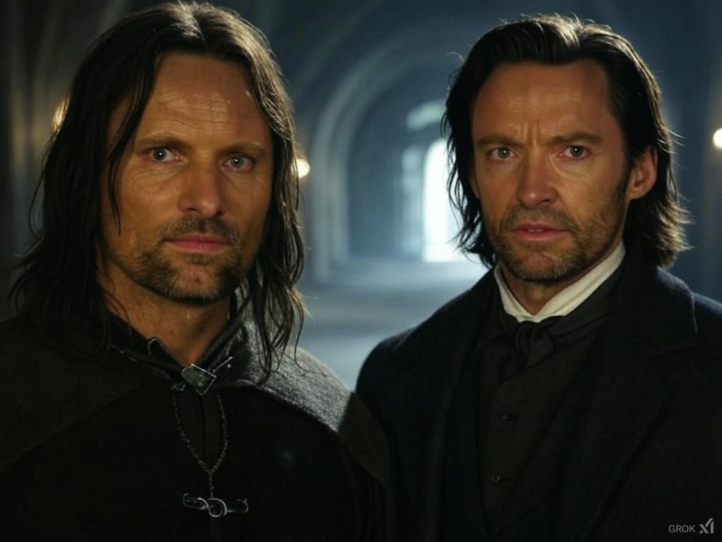
Anduril - In Tolkien’s Lord of the Rings books, Anduril meaning “Flame of the West” was the sword wielded by Aragon, the returning king of Gondor, as he led the armies of the West into battle with the forces of Sauron. If you’ve only seen the films, that’s the big fight at the end of The Return of the King with Viggo Mortensen playing Aragorn. Notably wielding Anduril allows Aragorn to command not just humans but a spectral army to win victory (see clip below) - a genius choice for a defence tech company that builds both hardware and software products.
Helsing - In Bram Stokers original Dracula story, Abraham van Helsing was the heroic vampire killer and monster hunter in a mysterious, frightening and dark 19th Century Europe. Van Helsing was a polymath and warrior and nemesis of Count Dracula. The analogy that Helsing (the company) draws between that literary universe and Helsing’s role in the modern world is powerful.
Both companies have come up with incredible brand names. Helsing is a great name for a European company that is brave, thoughtful, deadly and to be feared by adversaries. But Anduril is a perfect brand name. It acts as a standard and a call to arms for the US and its global allies.
Logos
It’s possible to spend a lot of time and money creating a bad logo and it’s often a huge source of contention during a branding process. As a result, in my experience, it’s an area where there’s a lot of compromise and often things tend to be dull. Let’s see how Anduril and Helsing have fared:

Anduril - Anduril’s logo is a simplified version of the pommel of the sword Anduril from the Lord of the Rings. The pommel is flipped upside down which helpfully looks like a stylised letter A. The font used in the name is Helvetica Now which is something of a classic. If I have any complaint it may be things are too safe and simplified, but that’s probably sensible given their market of buyers.

Helsing - The Helsing logo (and brand) was developed by the agency Spin. They explain that the stylised H in the logo symbolises a simplified version of ‘what needs to be protected’ - ie. the bit in the middle is protected by the heavy walls either side. I think this explanation is clear enough, though to my mind it also suggests maritime signal and semaphore flags which connects Helsing to a older and deeper history of European warfare dating back to the 18th Century.
While both logos have the potential to be iconic (it helps that they’re simple) my subjective opinion is that Anduril edges Helsing on the basis I think Helsing could have done a little more with their source material - ie. the stories are rich with meaning, and ‘what needs to be protected’ could apply to virtually any defence company.
Brand Identity
Brand identity is all the other aspects of branding beyond the name and logo. This includes colours, fonts, colourways, language, taglines use of imagery and image selection. Into this I’m also going to add any marketing activity. Together, the intention of brand identity is to help create a deeper understanding of the brand, even if this is happening at a subliminal level.
In the interests of keeping you actually reading this, my comparison is intended to be a pretty brief summary of each company as a full in-depth examination of each would require entirely separate posts of their own. So here goes:
Fonts colourways and Language
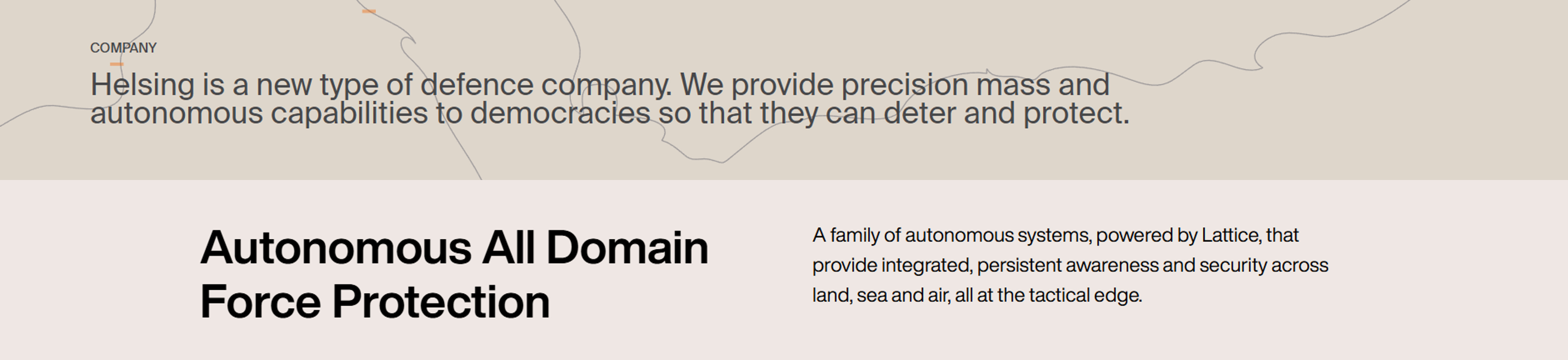
When it comes to brand fonts and colourways, both Anduril and Helsing have adopted the ubiquitous (and IMO very boring) “Defence Dun” font, colour and language combo for their brands. It’s something you see again and again with defence brands. It’s dull, but seems to be nearly industry wide - go to any random defence company website (like this, this, this, or this and you get either beige, off-white, cream, ivory or black). And so it is with Anduril and Helsing. As you can see from these website screengrabs, you could swap either brand around with little effort. So far, so dull.
Branded Imagery
At this point I’m going to disregard the product imagery, which again is pretty similar for both.
More interesting is the branded imagery - ie. the images that express some aspect of what makes the brand unique. The imagery is a key part of the brand positioning (which I’ll come to later) as it is very much about storytelling and represents how the brand sees itself:
Anduril - Helpfully for us, Anduril actually advertises, offering us a range of imagery and concepts for us to dive into.
So let’ start off with the wonderfully bonkers but incredible anime-inspired ad Anduril produced for their Barracuda cruise missiles. Yes, you read that correctly - an anime-inspired ad for cruise missiles.
Launching last September, it’s hard to know where to start with how utterly unique this piece of marketing really is. The connection to anime comes via the CEO, Palmer Luckey’s obsession with anime. But while the style is irreverent, the rationale for the film is a piece of genius - the Russian invasion of Ukraine in 2022 saw the US steadily drawing down its stocks of vital weaponry but without the capacity to rebuild quickly. Anduril is building just that capacity, which leads us to their next campaign.
Recently Anduril launched its “Rebuild the arsenal” marketing campaign. The audience for this was far wider than the usual ‘defence procurement’ DoD bureaucracy. Adopting the style and imagery that connects back to WW2 posters and the artists renditions of defence concepts common during the Cold War, Anduril is directly connecting itself to a period of strength, purpose and technological aspiration that drove the US forward.


Finally just last week, launched yet another genius piece of marketing - a very Spike Jonze-esque, low key but hilarious recruitment campaign, titled “Don’t work at Anduril”:
To me, this ad campaign to drive recruitment for Anduril feels completely superfluous - for the simple fact that all their marketing activity is at least partially about recruitment! That said it’s another great example of the culture and confidence of this irreverent organisation.
Helsing
Without a marketing campaign to go on, we’ll look at Helsing’s website for its branded imagery. Here a clear focus on nature and the natural world is strong. It’s an interesting direction for a defence brand to take. Helpfully, Helsing’s branding agency, Spin, has provided us with the rationale for this imagery on their website:
The use of imagery was carefully considered. Images of landscapes — across land, sea and air — are at the core of the Helsing brand and implies the importance of their work by showing its physical backdrops, the territories to be navigated and defended, while remaining neutral and elegant in appearance. The other uses striking images of flowers, an unusual choice for a defence or technology company, and is used for internal communications. These images symbolise the need to protect fragile things so that they can grow and flourish — a visual metaphor for Helsing’s approach to liberal democracies.


And from a brand identity perspective, that’s about all we have to go on from Helsing which is to say, not a lot.
As I noted before, this is a very brief assessment of these aspects of brand identity based on publicly available sources, and clearly we have a lot more from Anduril than we do from Helsing at this point. Therefore we know a lot more about Anduril than we do Helsing, which would suggest there’s more work to be done. But that aside, we have enough materials from both companies to give us an indication of how the brands perceive and position themselves, this allows us to compare their Positioning.
Positioning
Normally a review of brand marketing would start with a review of the respective brand’s positioning, however as mentioned earlier, I wanted to review the various strategic brand assets to reveal the respective brand Positionings.
Anduril - In Marketing for Mavericks, I suggested that the universal brand positioning for defence tech companies should approximate something like “Keep us safe, make us great”. Looking through Anduril’s brand and marketing activity, we can see Anduril does this, however beyond this a rather fascinating positioning emerges. With its unabashed patriotism, its echoes of Cold War terminology and visual style, and irreverent idiosyncratic style, Anduril could well claim its Positioning as “Make America Great Again”.
Relax, take a breath and calm down for a moment! Put aside all the political baggage of this term and put aside Trumps foreign policy stance. If you’re looking at an entity which really seeks to Make America Great Again via projection of smart, capable and efficient technology, Anduril is it. This is a compelling, emotive and aspirational positioning that forces other brands to follow or be left behind.
Helsing - Ascribing a positioning for Helsing is somewhat challenging. Helsing would describe its own positioning as something like “Defending the Defenceless” or “Defending what matters”. These are powerful territories. However with its unusual choice of messaging around ethics and use of imagery, Helsing has taken a more intellectual view of its role as a defence company. It’s not to say that appealing to intellect is bad, just that from a marketing perspective, it’s less powerful than appealing to emotion in what is a very emotive topic.
To me, Helsing’s positioning demonstrates the ambivalence that many Western Europeans see towards the role of defence, even after Russia’s invasion of Ukraine. Western Europe, especially Germany, where Helsing is based, has been suspicious, bordering hostile towards defence for decades. Helsing is pushing back against a culture and environment that saw Germany allow itself to become dependent on US defence guarantees. What this means is that in many ways, founding Helsing is an even more contrarian choice than founding Anduril. While Anduril was made a pariah by the tech industry which had become instinctively anti-defence, the US as a whole is highly supportive of defence industries. This was tough, but Helsing is pushing against an entire culture, which is brave and visionary!
Given this, there’s a great deal Helsing could lean into with its brand that has a great connection with its name - ie. the defence of the innocent when no one else has the courage to do so. This would be a deeply emotional and compelling positioning.
Wrapping Up
I’ll conclude this post with a thought: the missed opportunity of Helsing’s brand demonstrates point of why I’m writing these posts. On a marketing level, not only is Anduril leading the field, it is creating the field as it does so. Anduril is now marketing with the level of confidence and scope you’d expect of a mainstream consumer brand. If the thesis I set out in Marketing for Mavericks is correct, other defence brands need to step up their game to compete in what is about to become an incredibly active and competitive space. There’s huge opportunity for companies to define themselves and the defence tech sector in the coming few years. It will be fascinating to watch.
Game on.
In the next (and hopefully last) post on this topic, I’ll be offering my thoughts on the consequences - from a marketing perspective - of what will happen as a result of the US/Europe realignment the US has signalled in recent weeks. See you next time.